Twisted Pixel
Year: 2025
Service: Logo Design and Visual Identity
I was approached by Paul, the founder of Twisted Pixel photography studio, to design a new logo and visual identity for his business. Paul asked me to design a crisp, modern logo that would avoid the stereotypical images such as film, cameras, eyes, etc.

The Concept
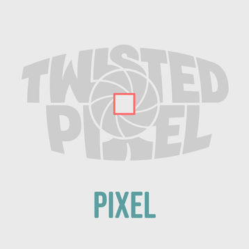
The logo I created for Twisted Pixel features bold, stylized lettering with a colorful circular icon at its center. The icon consists of eight twisted triangles arranged to resemble a camera shutter, with each triangle displaying a different color from the RGB spectrum. In the center of the icon, the negative space forms a subtle square, symbolizing a pixel. This unique design creates a memorable and visually striking effect, blending geometric shapes with vibrant colors.


The Logotype
The logotype wraps around the colourful circular icon, creating a dramatic fisheye effect that adds depth and dimension. This playful distortion draws attention and gives the design a dynamic, energetic feel. The combination of curved text and vibrant colours highlights the brand’s creativity and attention to detail, leaving a lasting impression on viewers.

The Logomark
The logomark can be used when the Primary Logo is unnecessary or when space constraints affect legibility.
For example, it is suitable for social media profiles, small-scale print materials, web favicons, and similar applications.

★★★★★
"I highly recommend Martin, he truly is one of the best designers I have worked with."
Paul Thomas, founder of Twisted Pixel

Hand-drawn Logo Approach
The Twisted Pixel logo is hand-drawn, giving it a unique, personal touch that sets the brand apart. This handcrafted approach reflects the studio’s commitment to creativity, authenticity, and attention to detail - values that also define its photography. By avoiding generic or overly polished designs, the hand-drawn logo adds character and warmth, reinforcing the brand’s artistic identity and making it feel more approachable and human.

Colour Palette & Typography
The typography chosen for Twisted Pixel uses three distinct typefaces to support the studio’s creative, modern, and professional identity. Bebas Neue SemiRounded is used for headers—a bold, curved typeface that adds confidence and approachability, ideal for strong first impressions. Lora Semibold Italic complements this in subheadings, bringing elegance and contrast with its classic serif form and graceful italics. For body copy, Poppins offers clean, geometric readability, ensuring clarity and consistency across all written content.
The brand’s colour palette - featuring soft neutrals paired with vibrant accents - captures the essence of a modern, sophisticated photography studio, striking a balance between minimalism and creative energy. Together with the thoughtfully chosen typography, this visual system strengthens Twisted Pixel’s identity as a polished, imaginative, and forward-thinking brand that values both aesthetic appeal and clear communication.

Brand Guidelines Document
Finally, I have created the Twisted Pixel Brand Guidelines Document, which defines the studio’s visual and verbal identity, ensuring consistency across all platforms. It outlines key elements such as logo usage, colour palette, typography, and imagery, providing clear direction for both internal and external use. This guide helps maintain a cohesive and professional brand presence that reflects Twisted Pixel’s creative and modern style.

Twisted Pixel Brand Visuals


